Complete Redesign of SteelCentral Connect, a Riverbed Technology Enterprise Application Performance Management Solution.
Riverbed Technology, an IT company, needed a redesign of the SteelCentral Connect application. I was contracted to help the existing UX team update the product and create a comprehensive design system.
The goal was to create a modern, beautiful, responsive website application that would allow users to define, implement important tasks, and understand the data dashboard management tool that visually tracks, analyzes and displays key performance indicators (KPI), metrics and key data points quickly.
This was accomplished by bringing the user interface, functionality, and visual data into an easy to view, simple to understand, and use application whilst maintaining consistency throughout the product.
My Role
I was hired as a contractor to lead the UX team through the redesign. I was responsible for:
- Data Visualization
- UI functionality
- Maintain UX methodologies
- Information architecture
- Branding and visual consistency
- Iconography, typography, and conceptual design
About Riverbed
Riverbed Technology, is an information technology company whose products consist of enterprise software and hardware focused on network and application performance management, edge computing, Wi-Fi and wide area networks, including SD-WAN and WAN optimization.
The Process
For 5 months, I worked with the 5 person UX team to understand stakeholder requirements, technical restraints, success metrics, and user behavior on the application to create a complete design system for the developers.
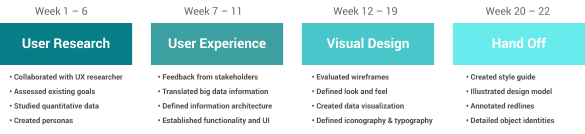
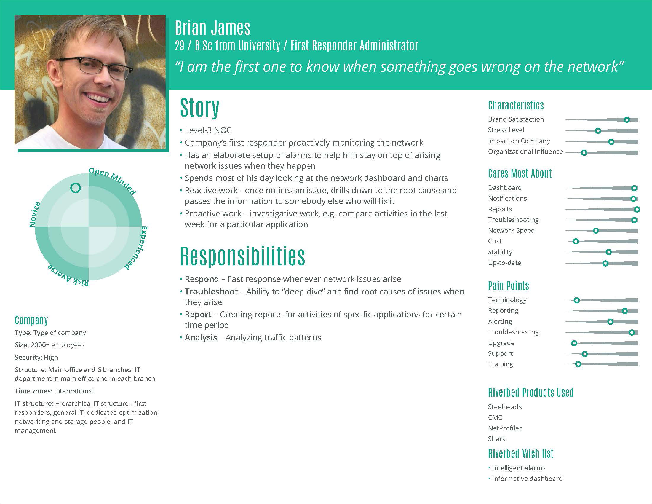
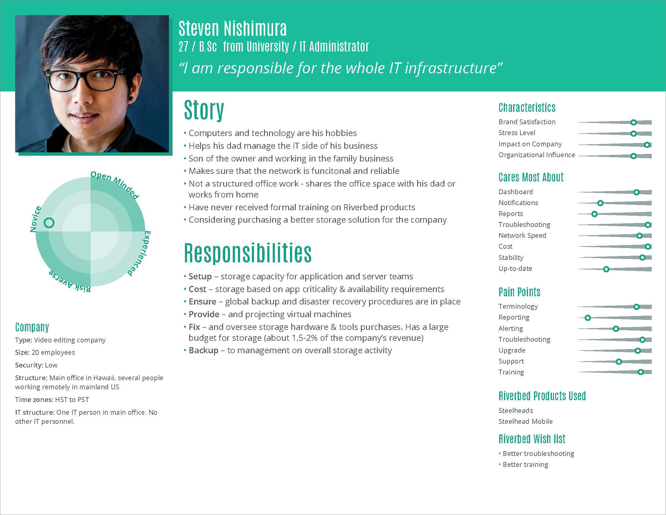
User Research
When starting this project, I worked closely with the UX researcher for Riverbed to understand and attain an in-depth understanding of user requirements through personas. I worked directly with stakeholders, product managers, and the UX team to interpret and define the affordances that determined the wire-frames as a complete interactive dashboard application.
Understand users, interpret needs and expectations into manageable design requirements
The research was conducted primarily by strategists, data analysts, and UX researchers. Personas were created by analyzing the user data, understanding the user needs to contribute to the findings for the design phase. Using this data I was able to develop solutions based upon the needs and goals of the users.
User Experience
Once I had an in-depth understanding of the user, my challenge was to interpret the developers’ wire-frame functionality design and translate the data into an easy to decipher visual design. The design should be relevant to the data model created by the engineering team to easily transfer into the existing enterprise software model.
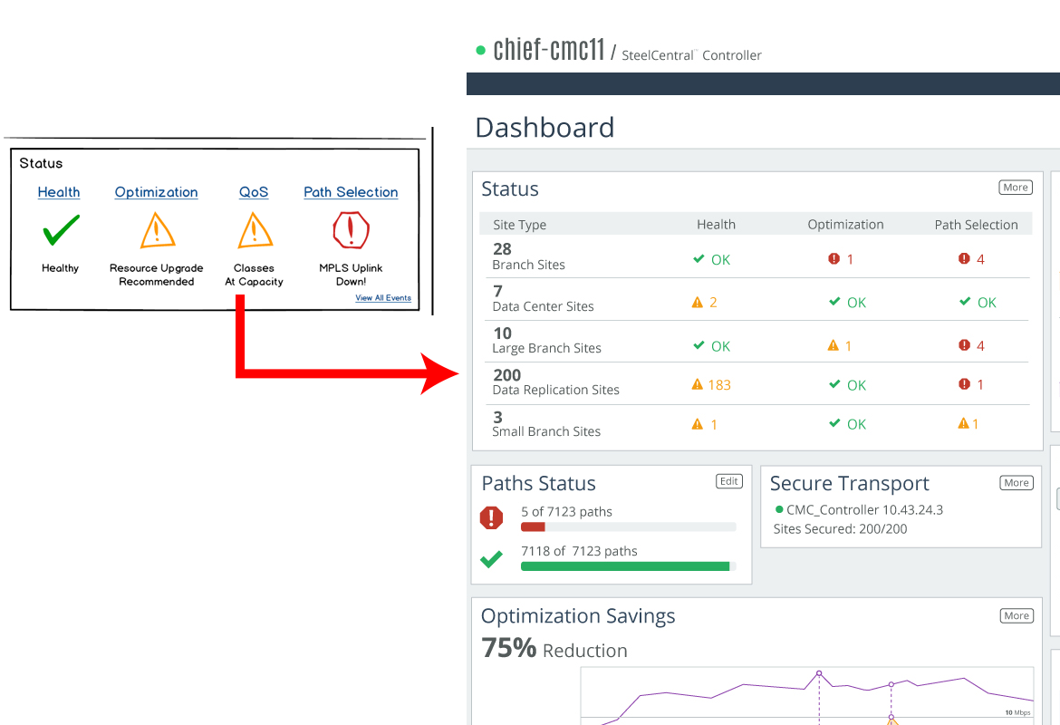
Information architecture: translating wire-frames to visual data and hierarchy
Using feedback from stakeholders I was able to translate existing wireframes by understanding the data visualization needed for each section. In this example the original idea was put down into a wireframes. It's basically an idea of visual data at this point. There wasn't an easily crafted existing chart solution to show the "Status". Working with development, I crafted a mockup that explained the functionality and requirements for the dashboard widget. I kept in mind accessibly views when rendering visual data. In this example, I not only used signal colors, but icons and words to indicate the different status modes.
Functional Design for Productive Insights
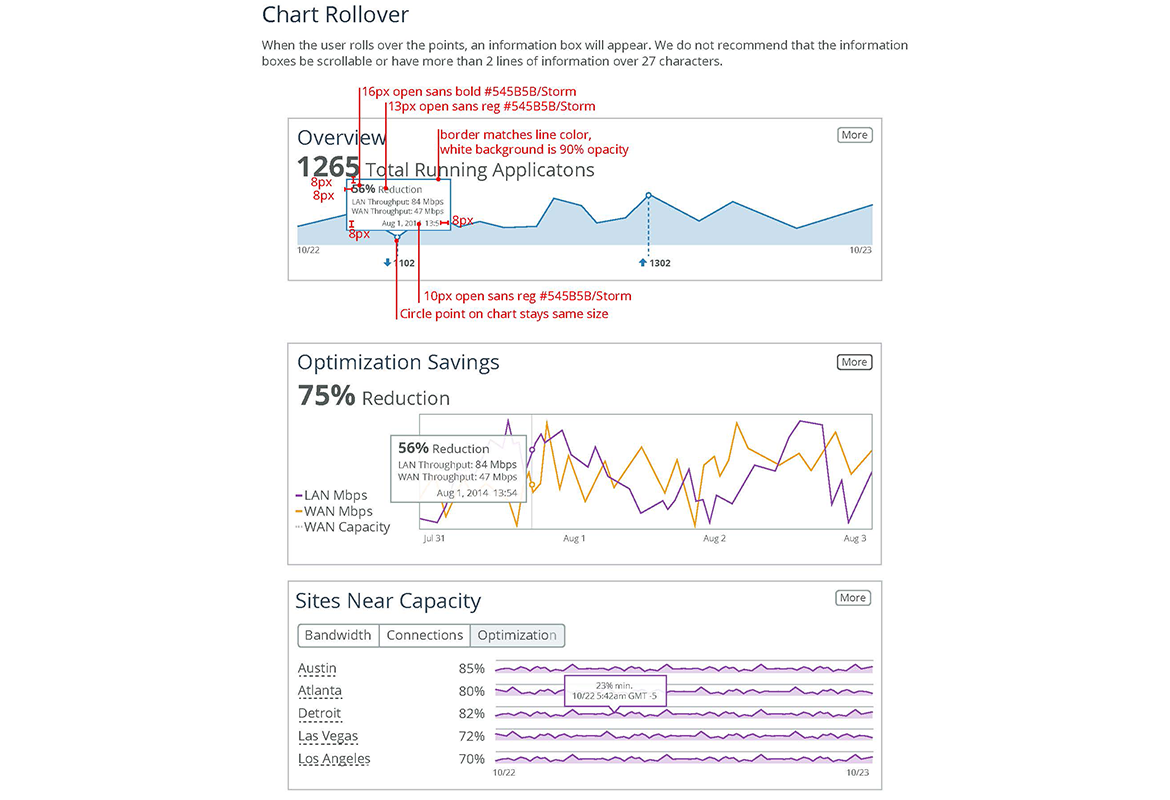
In this instance the data was focused more to an analytical chart based dashboard and required a line chart as opposed to a bullet or pie chart. This provides the user with at-a-glance information used for analysis and decision making. The primary goal is to help users make the best sense of the data, analyze trends, and drive decision making. Understanding what the user needs to quickly interpret large and small data in bite-sized widgets adds value to ease of use of the application.
Style Guide
The user experience and user interface design of the SCC application was just one part of a comprehensive design system. In addition, I created the requirements for the design elements that make up the complete ecosystem of graphics, interaction and architecture. The developers had a complete guide for all of their needs including fonts, colors, buttons, icons, animations, widgets, tables, and voice and tone.
Focusing on graphic styles
Here are a few examples of some of the pages of the design system. For a more in depth catalog of pages and my role, please contact me so that I might share a more comprehensive PDF explaining my role, my process and more explanation of the decisions that where made.
-
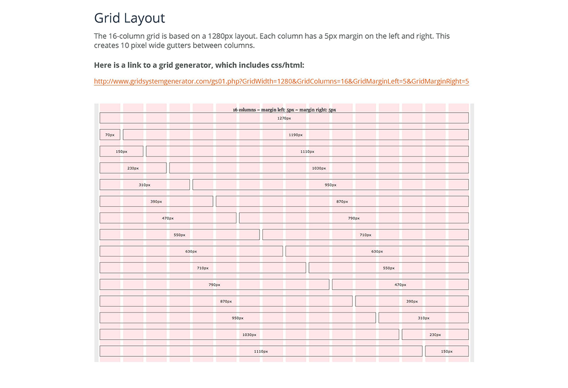
Responsive Grid
-
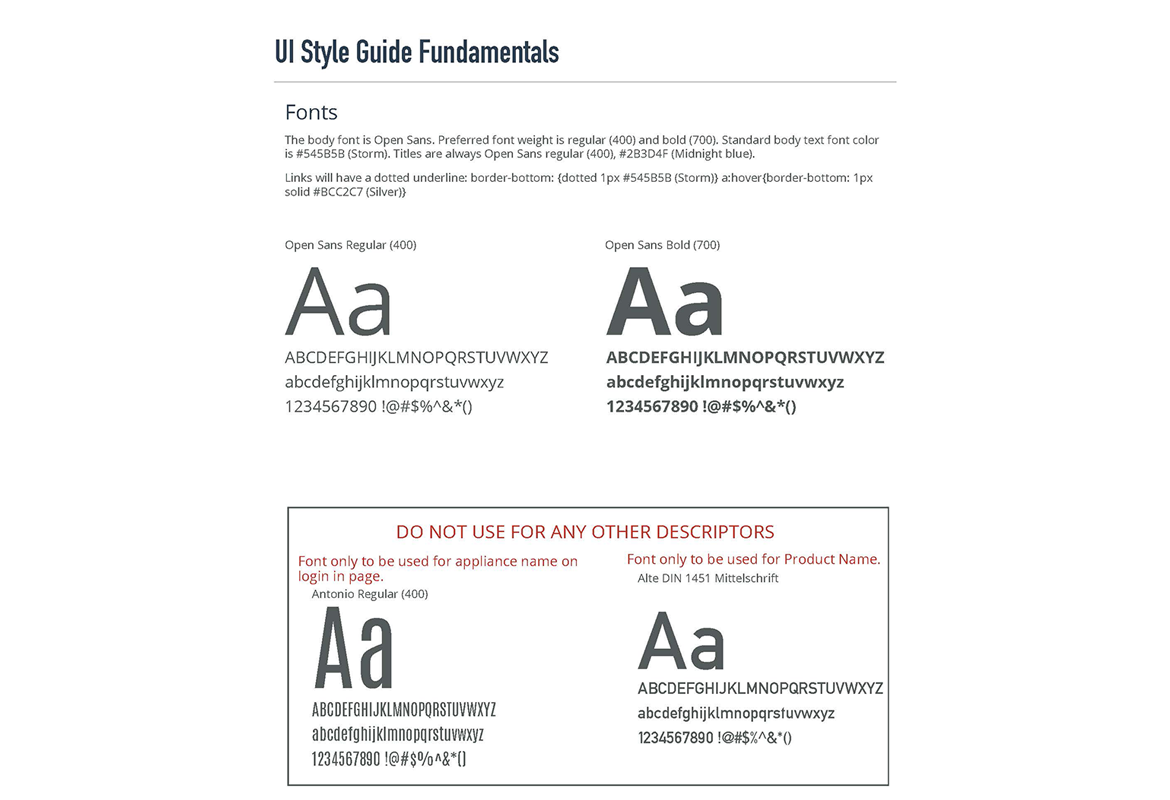
Fonts
-
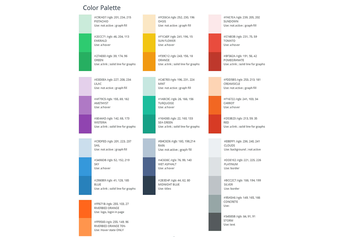
Colors
-
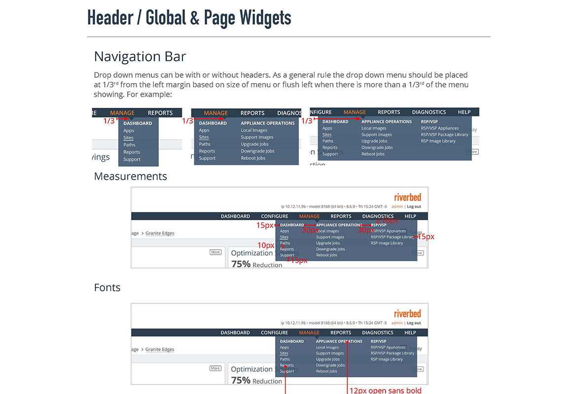
Drop Down Navigation
-
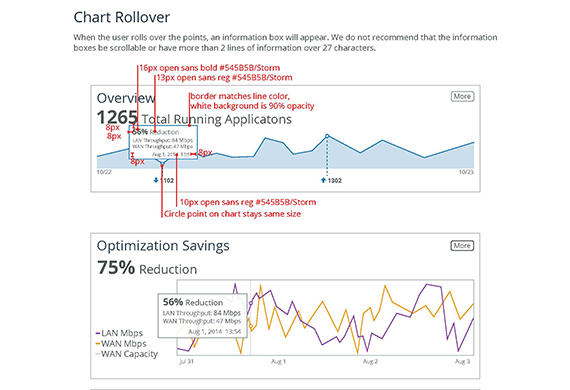
Charts
-
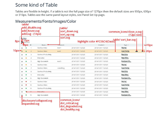
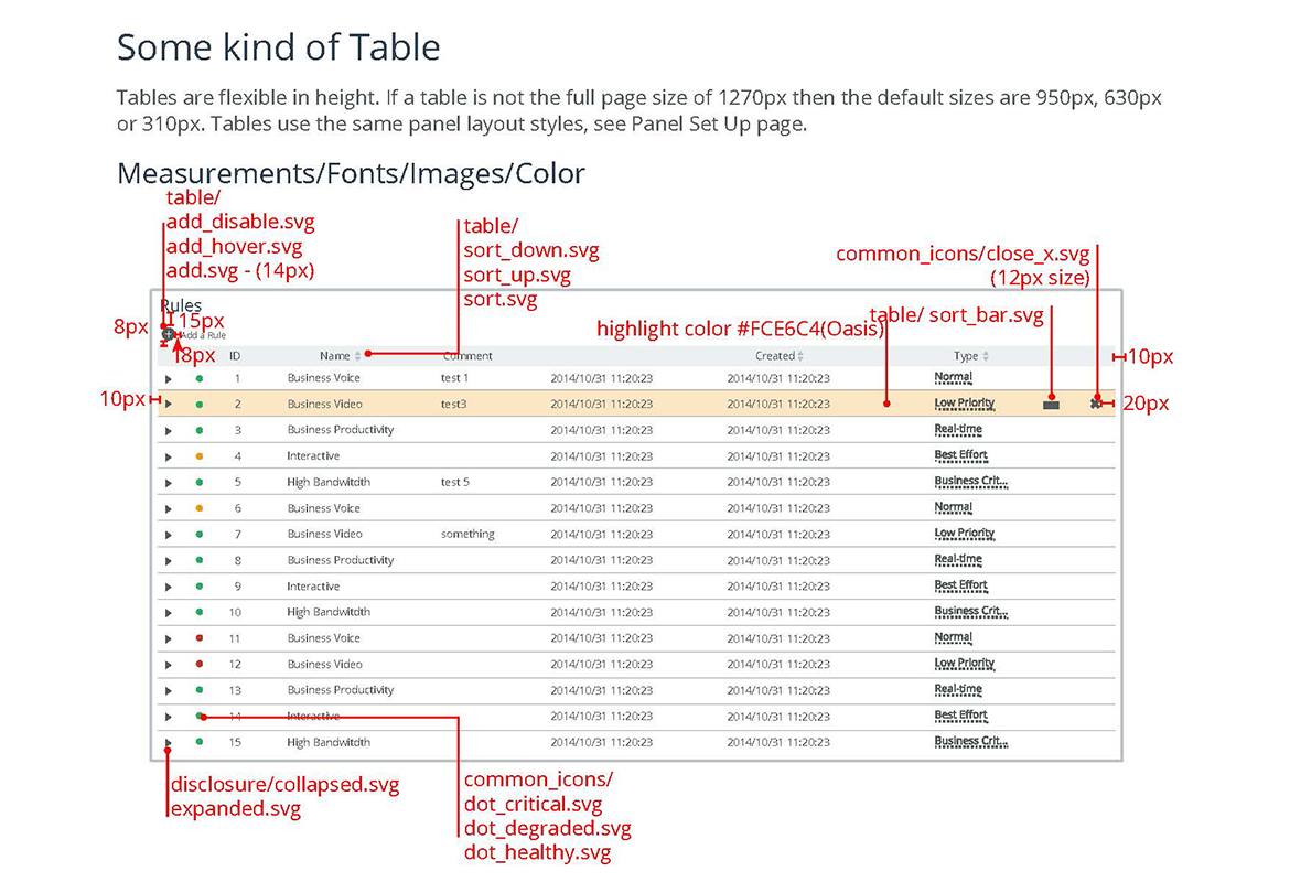
Tables
Takeaways
During my four month contract with Riverbed, I learned a lot about enterprise software and how a design system is integral for developers to create a cohesive brand across all of the Riverbed products.
Research brings a better understanding of user needs
Starting with the understanding of what user needs made it easier to fulfill user requirements. This informed my work, my understanding, and, ultimately, my design decisions when it came to translating visual information into a complete architectural design system.
The integral relationship between information architecture, user experience and design
Being part of the UX team gave me insight to the big picture to conceptualize characteristics, environments, tasks and work flows while focusing on user needs to create easy to understand visual information. I learned how important it was to give extensive attention at each stage of the design process to create industry standards and best practice solutions for configuration pages, dashboards, widgets, panels, tables, etc. to build a new design system.