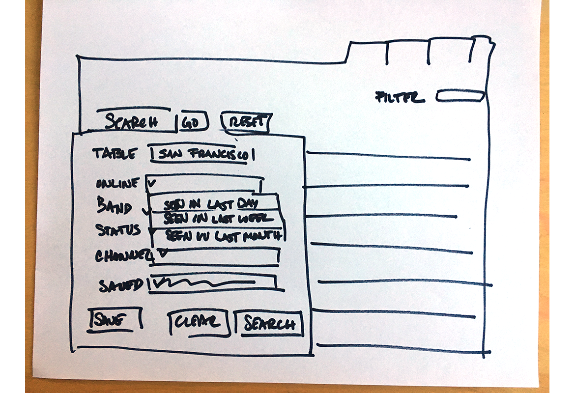
New Advanced Search Feature Proposed for the Riverbed - Xirrus WiFi Access Point Management System.
The challenge was to integrate large data into an elegant, easy to use advanced search solution and present a better way to utilize search in tables. In the current application, the admin had limited access to search capabilities to large table data. The admin should be able to filter through the tables as well as customize the information they are parsing.
This was an opportunity for me to take things to the next level by utilizing an advanced search process. I was excited to show them a better way to search data heavy tables as well as bring a more advanced search functionality to the whole of the site. This would contribute to the scalability for future functionality of the site.
The app contained a data heavy table structure which was difficult to search and maneuver through for the IT admin to parse the information they required. In the current app iteration, they were capable of searching only 3 columns of the complete set of 44 columns. The columns were hidden by default showing an average of 10-15 columns of data or the user could manage which columns to show. This still required the user to scroll along the bottom of the table to see columns that could be hidden if they did not fit the fixed page width.
My Role
I was the only UX designer from our team who worked directly with Xirrus, I was responsible for:
- Experience design
- User interface functionality
- Heuristic evaluation
- Create wireframes for data visualization
- Maintain UX methodologies
- Branding and visual consistency
About Riverbed
Riverbed Technology, is an information technology company whose products consist of enterprise software and hardware focused on network and application performance management, edge computing, Wi-Fi and wide area networks, including SD-WAN and WAN optimization.
The Process
I was very excited about this project as I believe a web site can be made or broken by their search functionality. If a user can’t find what they are looking for, they normally go to the search bar. If the search engine doesn’t supply them with the information they need or suggest a solution, there’s a pain point that might frustrate them while using your product, or contact customer support, or find another solution outside of your product.
- I started by researching advanced search functionality as well as a heuristic evaluation of the existing application.
- Because this problem was specific to data heavy tables, I considered a possible redesign of the way the tables appeared and were accessed in the site, but ultimately came back to an advanced search option.
- Interviewed shareholders to understand their pain points when using data heavy tables.
- Working with the UX team, I whiteboarded and brainstormed to outline structure and expectations, then moved on to hand drawn sketches and wireframes.
- Once I had a working model, I presented the solutions to the project manager and development team for feedback.

Visuals and Presentation
Once I finished the simple solution that the project manager originally requested, I made a presentation to state my case for the development of an advanced search. Using low fidelity mockups I walked them through the concept.
1. The first search box would be the expected information entered search. This option would not show the current drop down if the user did a regular search.
2. Advanced will activate the drop down has a pull down option to select saved searches. This drop down includes a table term search as well as items that have multiple choice values and not unique values.
3. Reset will reset all information; user can start over.
4. Table search will only search the table.
5. After doing an audit of all 47 table items, we determined that these 7 headers have the most relatable multiple choice selection. We can filter through these main subjects with more advanced filter options in each pull down.
6. Example of column selection and search.
7. This is an example of an and/or filter, the user can choose one or both options
8. Column reference for filter.
9. The user can also save searches which will appear in the area that says “There are no saved searches” this would be a drop down menu of their saved searches with the option of deleting them from that list.
10. Option to save current search criteria. This is especially helpful if an IT admin needs to run specific reports with specific information.
11. Clear would close the window, search would activate search.

What I learned
A search engine is a powerful and practical function of a web application. It’s used to solve problems, accomplish tasks, can substitute for help, or it can simply find information that is not obviously navigable. Most importantly a search engine needs to make sure it delivers results that are relevant to what users search for. A user can experience frustration and annoyance if they can’t continue to use the application to their specific needs. If the end user can’t work smoothly and efficiently then they find a better application that can.
Doing the work is it's own reward
While the idea and presentation for the advanced search engine was well received; there wasn't enough time or manpower to facilitate the advance search option. It was then determined that we revisit this option at a later time. So although this idea didn’t make it into the product, it doesn’t make the idea a bad one, sometimes budgets, manpower, or time play into decisions to make the most viable product, not necessary the advanced viable product.
